
Design
Email Accessibility: Alt Text, Contrast, and What Screen Readers Actually Do With Your HTML
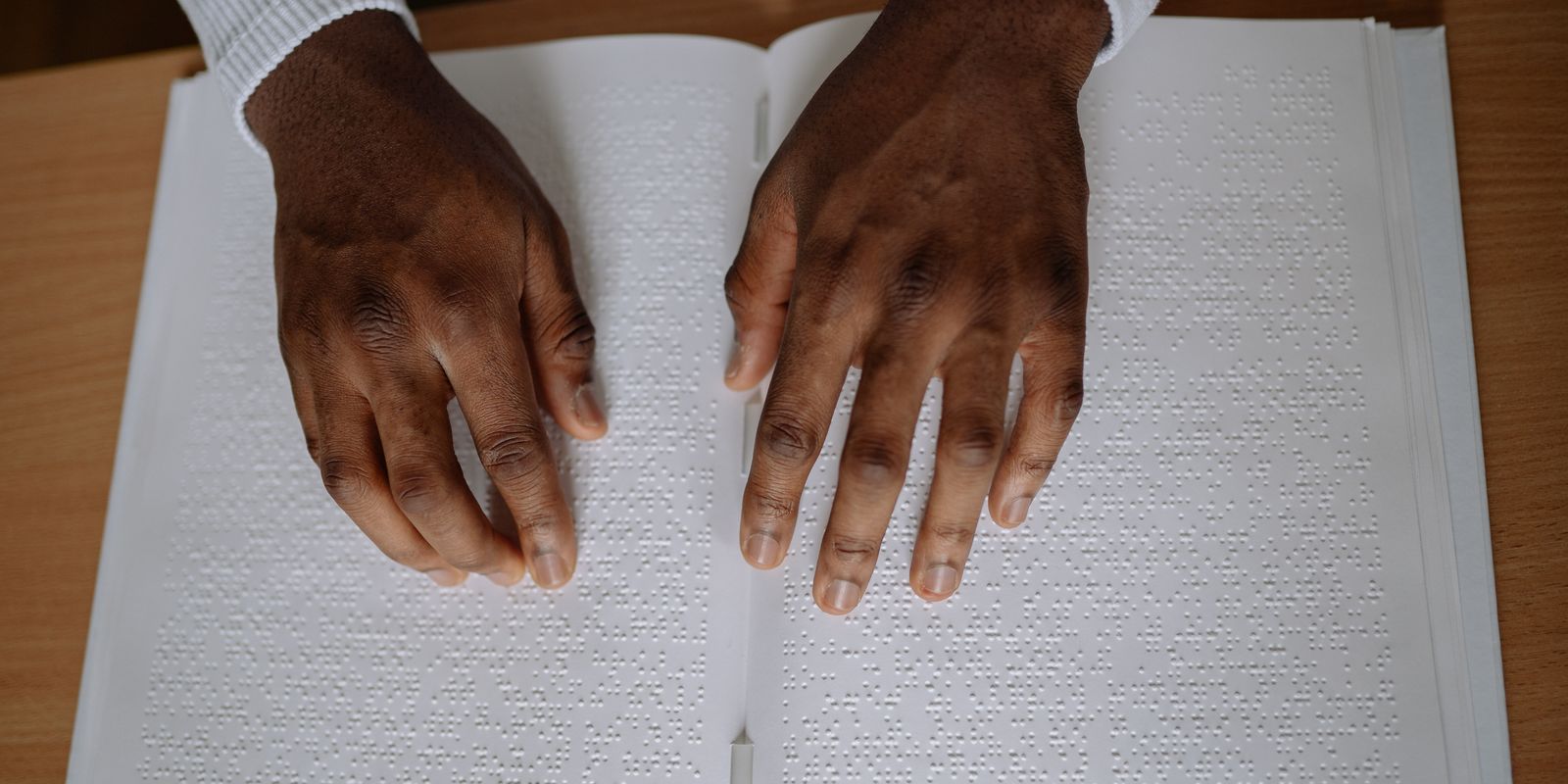
Accessibility usually shows up in email guides as a single bullet point near the bottom, "add alt text," wedged between font advice and a note about file size. That framing undersells it. Over 2.2 billion people worldwide live with some degree of vision impairment. This isn't a niche audience you're optionally accommodating, it's a meaningful slice of every list you'll ever send to, most of whom you have no way of identifying in advance. And a lot of what actually helps them also just makes the email better for everyone else too, which is the part that gets lost.
Alt text isn't optional, and empty isn't the same as missing
Every meaningful image needs real alt text, and every purely decorative image (a divider graphic, a background flourish) needs an explicit empty alt attribute, alt="", so a screen reader knows to skip it instead of announcing "image" for something conveying nothing. Skipping alt text entirely does something worse than just failing accessibility standards: most major email clients block remote images by default for every single recipient, sighted or not, until they explicitly click to load them. Alt text isn't a screen-reader-only feature, it's what a meaningful chunk of every send actually sees on first open, full stop. If you write your alt text like a filler afterthought ("image1.jpg", or just leaving it blank on something that matters), you're not just failing an accessibility audit, you're shipping a broken experience to a much bigger group than you think.
The contrast ratio nobody checks
WCAG 2.1 AA, the standard most accessibility audits actually measure against, requires a contrast ratio of at least 4.5:1 for normal text and 3:1 for large text (18px+ or 14px+ bold). The AAA level goes further, 7:1, though that's a harder bar to hit in a marketing context and less commonly enforced. Here's the part that catches people: a lot of "clean, minimal" email design leans on light gray text, and a lot of that gray fails outright. Medium gray (#999999) on white comes in around 2.8:1, well under the 4.5:1 floor. It's not that the design looks obviously broken, it looks tasteful and quiet, which is exactly why it's easy to ship without anyone noticing the contrast is actually too low to read comfortably, especially for anyone with low vision, or honestly anyone reading on a dim phone screen outdoors.

What a screen reader actually does with your HTML
- Headings aren't decoration, they're navigation. A real h1/h2 hierarchy lets a screen reader user jump directly to the section they care about instead of listening to the entire email top to bottom. Text that's just made to look like a heading with bold and bigger font-size, but isn't marked up as one, is invisible to that navigation entirely.
- Layout tables need to identify themselves as layout. Email HTML still runs on table-based layouts under the hood for client compatibility, but an unmarked table reads to a screen reader as actual tabular data, rows and columns of information, which is confusing noise. role="presentation" tells it "this is structural, not content."
- "Click here" is meaningless out of context. Screen readers commonly let users pull up a list of every link on the page in isolation. A CTA that just says "click here" or "learn more" tells that user nothing about what it does. The link text itself needs to stand on its own, "Start your free trial," not "click here."

If you're going to test with one screen reader, know which one
The most recent WebAIM screen reader survey found NVDA is now the most commonly used screen reader overall at roughly 66% of respondents, narrowly ahead of JAWS at around 60% (many people use more than one). On mobile specifically, VoiceOver dominates by a wide margin, over 70% of respondents use it there. The practical tip buried in that data: NVDA is free and works on Windows, JAWS is expensive and licensed, so if you're testing an email by hand for the first time and don't have a budget for it, NVDA plus a basic read-through gets you real coverage of the most common desktop case without paying for software.
A short list that's actually doable before your next send
- Every meaningful image has real alt text; every purely decorative one has alt="".
- Body text and background meet at least a 4.5:1 contrast ratio, run it through a contrast checker if you're unsure, don't eyeball it.
- Headings are marked up as headings (h1, h2), not just styled to look like one.
- Every CTA and link makes sense read on its own, out of surrounding context.
- Color isn't the only signal for anything important, an error or a sale price shouldn't rely on red alone.
None of this requires a redesign. It's mostly attention to fields you're probably already filling in anyway, alt text, link copy, heading tags, just filled in with the assumption that someone genuinely depends on them, because a meaningful number of your recipients actually do.
Built on real HTML, not a flattened graphic
Emlet generates actual headings, real alt text fields, and contrast-checked color pairings by default, not a picture of an email pretending to be one.
Generate your first email free