
Blog
Writing on email that doesn't suck
Design, deliverability, and the occasional statistic. No listicles about "10 email marketing tips" unless the tips are actually good.

Mobile Email Design: The Specific Things That Still Break on Phones
Most opens happen on a phone, and most email design still gets built and approved on a desktop monitor. The gap between those two things shows up in a handful of specific, fixable spots.

Image-to-Text Ratio in Email Design: Does the Old Rule Still Matter?
The 80/20 rule, mostly text with a little image, got repeated for years as a spam-filter workaround. Filters mostly moved past it, but the ratio still matters for a completely different reason now.

Designing for Dark Mode: What Actually Breaks in Email
About a third of email opens now happen in dark mode, but each client decides what that means on its own, sometimes ignoring your CSS entirely. Here's what actually breaks, and the two legitimate ways to handle it.

White Space in Email Design: Why More Empty Space Usually Converts Better
Cramming more into an email feels like getting more value out of the send. The data points the other way: whitespace measurably improves comprehension, and one well-known case study saw a 232% conversion lift from removing clutter around a single CTA.

The Right Font-Family Stack for HTML Email (and Why the Order Matters)
Copy-paste font-family stacks for HTML email, plus the actual mechanism that decides which font in your stack shows up in a given recipient's inbox and which ones never get a chance.

Web Fonts in Email: What Actually Renders, and What Silently Falls Back
Drop a Google Font into an email and a meaningful share of your list will never see it. Here's exactly which clients render custom fonts, which ones fake it, and how to build a fallback stack that still looks intentional.
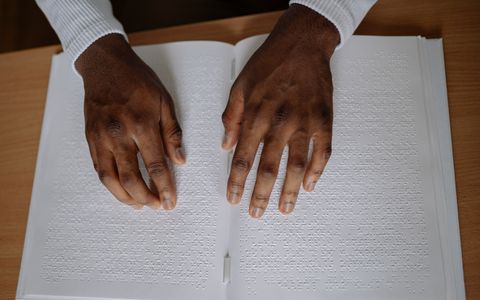
Email Accessibility: Alt Text, Contrast, and What Screen Readers Actually Do With Your HTML
Accessibility gets treated as a checkbox for a niche audience. It isn't. Here's what alt text, contrast ratios, and heading structure actually do, and why most of it helps every recipient, not just screen reader users.

How to Design a Marketing Email When You're Not a Designer
You don't need Figma skills to make an email look professional. Here's the actual structural stuff that matters, and the stuff you can safely ignore.

The Ultimate Guide to Email Fonts
Everything you need to know about choosing, embedding, and fallback-stacking fonts in HTML email — client support matrix, recommended stacks, and sizing best practices.
Comparing tools? See how Emlet stacks up against Mailchimp, Canva, and ChatGPT →